App icon, screenshot and video size guidelines for iOS and Android
Exact app icon, screenshot and video size guidelines for iOS and Android, with export rules, safe zones, and testing advice.
By Shoham Lachkar · Published

Intro
You need one authoritative reference that removes guesswork. This guide gives exact, publishable app icon, screenshot and video size guidelines for iOS and Android, plus export settings, common compliance traps, and practical testing rules you can use on launch day. Follow these rules and you avoid rejections, pixelated previews, and wasted creative tests.
App icon, screenshot and video size guidelines for iOS and Android - Quick reference
This quick reference lists the concrete sizes and rules you will use when exporting assets.
Icons
- iOS App Store master icon: 1024 x 1024 px, layered where supported, 72 DPI, sRGB, PNG or 32-bit PNG recommended, per Apple HIG.
- Android Store listing icon: 512 x 512 px, 32-bit PNG, sRGB, max file size 1024 KB, do not add your own corner radius or drop shadows, per Google Play guidelines.
- Android adaptive icon layers: foreground 108 x 108 dp, background 108 x 108 dp, keep critical artwork inside the safe zone (~72 x 72 dp).
Screenshots
- iOS App Store: upload screenshots for the largest device in each device family. Typical source sizes to use:
- iPhone 15 Pro Max (portrait): 1290 x 2796 px
- iPhone 14 / 13 / 12 Pro (portrait): 1170 x 2532 px
- iPad Pro 12.9 inch (portrait): 2048 x 2732 px Apple will scale down for smaller devices when you upload the largest device size, per App Store rules.
- Google Play: minimum 320 px, maximum 3840 px for either dimension. Recommended aspect ratio 16:9 for phone screenshots. You must upload 2 to 8 screenshots per device type (phone, tablet, TV, Wear OS).
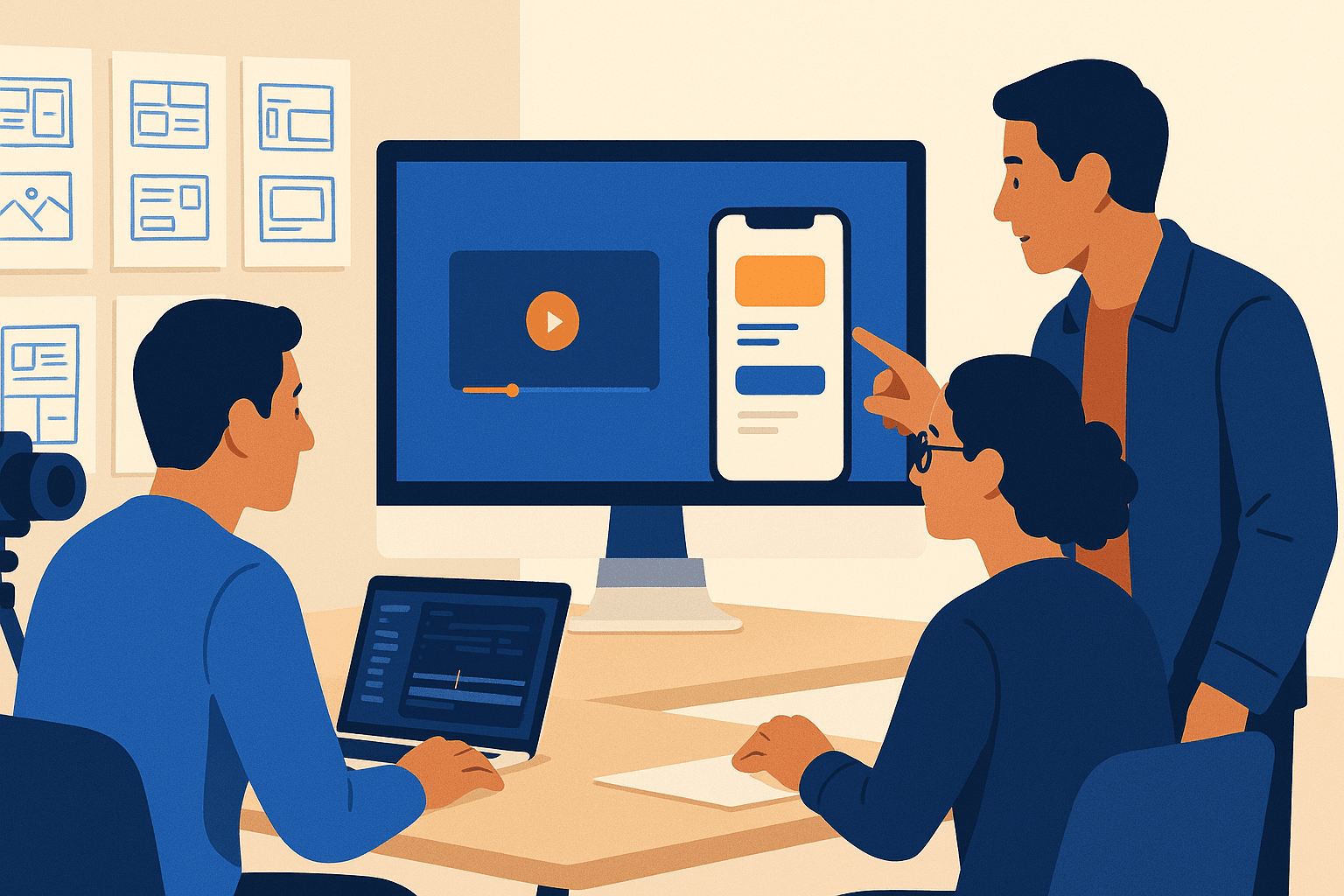
Videos and previews
- App Store App Previews: follow Apple HIG for format and length. App Previews are short, focused clips that demonstrate core flows. Keep them tight and attention-driven. Apple prefers you supply device-sized videos so the store can play them natively.
- Google Play feature video: use a clean YouTube link in your Play listing. Keep the primary message under 30 seconds to 60 seconds. Follow Google Play guidelines for content and avoid promotional overlays that imply store endorsement.
Files and color
- Color profile: export in sRGB for both stores.
- File formats: PNG for icons and screenshots where transparency or lossless is needed; JPEG for large photographic screenshots to save file size. Use 32-bit PNG for icons where supported.
- Max sizes: App Store screenshots up to 10 MB each; Google Play screenshots up to 8 MB each. Play listing icons max 1024 KB.
How to export icons and avoid the most common compliance mistakes
iOS icon export - single master
Apple expects a 1024 x 1024 px master icon that the system will scale to runtime sizes. That makes your life simpler, but the design rules are stricter:
- No tiny text or thin strokes. These vanish when scaled.
- Avoid inner shadows that rely on the platform applying its own effects. Per Apple HIG, the OS will add corner radius and visual treatment in newer releases.
- Test the master at scale: view at 40 px, 80 px, and 180 px to validate legibility.
Export checklist for iOS icon
- 1024 x 1024 px, PNG, sRGB, 72 DPI.
- Save a layered source (PSD / Figma file) so you can iterate without redoing composition.
- Check contrast at small sizes and remove micro-detail.
Android adaptive icon export - two layers and safe zone
Android uses adaptive icons rendered at runtime, so you must supply separate foreground and background files. The system may mask the icon to circles, rounded squares, squircles, or others.
Practical rules
- Provide both layers at 108 x 108 dp. Keep all important content within the center safe zone of about 72 x 72 dp.
- Do not add your own corner radius or outer shadow. Google applies masking and shadows itself, and adding them can cause rejection.
- For the Play Store listing icon, export a 512 x 512 px full square. Do not include shadows or micro text.
Export checklist for Android icons
- Adaptive foreground: 108 x 108 dp source (export at required px for your design tools), sRGB PNG, no shadow.
- Adaptive background: 108 x 108 dp, plain backdrop or subtle pattern that does not compete with foreground.
- Store listing icon: 512 x 512 px, PNG, under 1024 KB.
Screenshot production rules that drive conversion
Screenshots are the primary conversion lever on the product page. These are the specific rules you should follow when producing them.
Design and composition
- Lead with your strongest message in the first screenshot. Research shows the first three screenshots get the most attention.
- Use device frames selectively. Device frames increase perceived realism, but they reduce usable space. For small screenshots, prefer full-bleed compositions.
- Localize screenshots for target markets. Replace text and call-to-action labels in localized images rather than relying on the store translation alone.
Technical rules and sizes
- iOS: upload the largest device screenshots for each family. Apple will scale them down for smaller form factors. Use the device dimensions listed earlier and test screenshots on the actual device sizes.
- Google Play: upload screenshots for each form factor because Play does not auto-scale between device classes. Respect the min 320 px and max 3840 px limits and keep the max dimension no more than twice the min dimension.
File optimization
- Use PNG for screenshots with UI or text overlays. Use high-quality JPEG for photographic content to save file size.
- Keep color profile sRGB and ensure every exported file stays under the store's max size limits.
Video guidance - make previews that convert and comply
Video previews increase engagement when they show the core value quickly and without fluff. Follow store rules, but optimize for attention.
Story and length
- App Store: keep app previews short, 15 to 30 seconds, focused on a single core flow. Use a cold open: start with the problem, then show the solution in the first 3 to 5 seconds, per best practices highlighted by Apple HIG.
- Google Play: use a short trailer-style YouTube video. The Play audience often expects value props immediately, so aim for 20 to 45 seconds.
Technical and creative rules
- Avoid overlays that imply certification or store endorsement.
- Include device-scaled recordings when possible. Record at the device resolution you will display to avoid scaling artifacts.
- Keep captions concise and localize them for target markets rather than burning in extensive text.
Encoding tips
- Use H.264 or H.265 where supported, and export at 30 fps. Keep a high bitrate for clarity but balance file size for store upload limits.
- For Apple, follow Apple HIG on allowed formats and lengths. For Play, host the video on YouTube and use the store controls to select the clip.
A/B testing creatives and measuring wins - concrete rules
Testing creatives is the only reliable way to know what converts. Here are pragmatic rules you can apply to your store experiments.
Experiment design
- Start with a hypothesis: e.g., "Changing the first screenshot headline from feature to benefit will increase tap-through rate by 10 percent." Keep hypotheses narrow.
- Variant count: test one variable at a time when possible. If you must test multiple variables, use a factorial plan but expect larger sample needs.
Minimum sample and run-time guidance
- Aim for a minimum of 5,000 to 10,000 impressions per variant as an initial threshold for Play Store experiments. For App Store Product Page tests, aim for at least 10,000 impressions per variant to detect moderate lifts.
- If your baseline tap-through or install rate is low (under 5 percent), plan for 30,000+ impressions per variant to detect 10 to 20 percent relative lifts with reasonable confidence.
- Run tests until you reach statistical significance at 95 percent confidence or for a consistent time window - typically 14 days to capture weekday and weekend behavior.
Measuring meaningful lifts
- Absolute changes matter more than relative percent. A 1 percentage point absolute improvement on a 2 percent baseline is a 50 percent relative lift, but it may still be small in downstream installs. Track both view-to-tap and tap-to-install conversion.
- Monitor downstream metrics after launch. A screenshot that boosts taps but lowers retention or increases uninstall rate is a false positive.
Tools and workflow
- Use platform experiments where available. Apple provides product page experiments; Google Play has store listing experiments. Complement store experiments with third-party A/B tools for split-testing ad creatives and UA landing pages.
- Track experiments in your ASO toolchain and link results to your App Growth dashboards. For a starting point, review resources in AppeakPro's Learn about ASO and ASO Tools to connect experiments to keyword performance.
Platform gotchas and compliance traps to avoid
- Do not include promotional badges or claims such as "#1" or "Best App" on Android icons. This violates Google Play metadata rules and can block publication, per Google Play guidelines.
- Avoid microtext on icons. Both iOS and Android scale icons dramatically and text becomes unreadable or looks like visual noise.
- Do not bake your own rounded corners or shadows into launcher icons on Android. The system applies adaptive masks and shadows.
- On iOS, do not rely on system effects being present on older OS versions. Test icons and screenshots across multiple OS versions if you support them.
Closing - implement, test, repeat
You now have concrete export sizes and practical rules to ship compliant and high-performing creatives. Two final operational rules:
- Keep a versioned source library. Save layered masters for icons, high-res PSD or Figma files for screenshots, and raw footage for videos. This cuts iteration time dramatically.
- Test everything that matters. Use small, targeted experiments to validate hypotheses, then roll winners broadly.
If you want us to audit your current assets against these rules, run a free audit at /#audit. If you are ready to manage iterative creative tests and track store experiments at scale, create an account at /signup and let AppeakPro automate the audit and experiment workflow.
Internal resources to check next: read our guides on Learn about ASO for strategy basics and ASO Expertise for creative critique workflows. Also check Store Guidelines to verify platform policy updates before publishing.
Frequently asked questions
Do I need separate screenshots for every device size on iOS?
No. For iOS, upload screenshots for the largest device in each device family (for example, iPhone and iPad). Apple will scale them down automatically, per Apple HIG. Still verify legibility at smaller sizes before publishing.
What is the safe zone for Android adaptive icons?
The center safe zone is approximately 72 x 72 dp inside the 108 x 108 dp layers. Keep all critical logo elements inside that area to avoid cropping by adaptive masks.
How long should an App Store preview video be?
Keep App Store preview videos short and focused, typically 15 to 30 seconds. Start with the core value in the first 3 to 5 seconds to maximize play-through and impact.
What file formats and color profile should I use?
Use sRGB color profile. For icons and screenshots, use PNG when you need lossless quality or transparency, and high-quality JPEG for photographic screenshots to save file size. For videos, use modern codecs like H.264 or H.265 as supported by the stores and follow Apple HIG and Google Play guidelines.
How many impressions do I need to run a reliable store creative test?
Aim for at least 5,000 to 10,000 impressions per variant as a starting point. If baseline conversion is low, plan for 30,000+ impressions per variant to detect moderate lifts with confidence. Run tests until you reach 95 percent significance or a stable 14-day period.
Side by side
Creative agency vs AppeakPro
Creative agencies produce great work but at retainer prices and quarterly turnarounds. AppeakPro analyses your existing icon and screenshots and ships the creative brief — your designers execute the actual production.
Creative / brand agency
- Cost
- $10,000-$50,000 / quarter
- Speed
- Months of back-and-forth
- Output
- Finished creatives, but slow and capped by retainer scope
Freelance designer
- Cost
- $3,000-$15,000 / cycle
- Speed
- Weeks
- Output
- Production capacity, but no ASO strategy direction
AppeakPro
- Cost
- Flat per audit
- Speed
- Minutes
- Output
- Concrete creative brief — what to test, the hypothesis, the layout direction — your designers implement
Skip the creative agency retainer. AppeakPro produces the brief; your designers ship the production. Faster cycles, fraction of the cost.